Showing posts with label art appreciation. Show all posts
Thursday, March 1, 2012
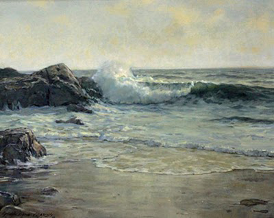
Big Wave Study
This was a massive challenge, I wanted the big wave to star, with all the wind and force, and the foreground to have a highly agitated feel of rolling movement that expressed the day I saw this. I wanted to do all of it with brushwork suggesting the details without getting out a rigger brush and putting it all in. This is part of Aspevig's idea of "knowledge gaps" that the artist suggests enough, but leaves gaps for the viewer to fill in from their own experiences. When a viewer does this the discovery produces endorphins in the brain that leads to great pleasure and a very enjoyable viewing experience.
It was hard to have the big wave star and not lose that to too much foreground competition. I scraped off the foreground 4 times and once got out a rag and took it back to canvas. I'm starting to learn that I can't do it all on one painting and to be happy if some part is there and to know the next ones I'll get more.
I also created a lavender sky here gradating in warm-cool and in value r-l. I needed a lower value sky to get the blowing spray to show. There is a gentle S movement of light, (Rem naples yellow light, to carry the eye front to back) I used 2 whites a warm one and a cool one, something that is now part of my palette, with so much white in a seascape it helps to create more variety in the pale tones.
In the detail you can see how I'm using brushwork alone to make the suggested details. This work is 6x12, and if I eventually go bigger I can put in more with the space, working up some layers of glazing to enhance the depth.
detail
the detail is nice by itself, its a good feeling when I get something into the painting that was felt the day I saw it.
Friday, February 3, 2012
Brushwork where to start
I've mentioned before that all my university art school training was in abstract art, and until the last 7 years that's mainly what I did. Seascape is the best place for an abstract artist in representational work. The place where both collide like the sea on a rock.
Todays topic is brush work. We've all heard the term, and I even have the book Brushwork Essentials which gave me some idea there was such a thing. Only lately have I begun to get it going in my own work. Paying attention to it in yours it can help you to create higher level work.
First notice that each of us has a different "touch" our unique signature, we don't want that to change but to grow, on the other hand we want to make it conscious, to make our hand do what we intend, and not wander off unattended dabbing away. So the first step is to notice that you ARE mindlessly dabbing because you don't know what to do, or your mind has taken a side trip into the past or future. What to eat for dinner, or any other of the 60,000 thoughts they say we think each day. When you notice mindless dabbing just stop painting, redirect your mind to the thing in front of you, find your place and begin again. Staying present is easier if you use physical cues, the sound of the brush, movement of your arm, and then let go, your body knows how to paint if you let it. But slow down, you are not Bob Ross sloshing across the canvas( unless you want that rush of just slapping things on, it's ok sometimes, but seldom gets really great results in brushwork) You are the conductor of the music, choosing violins, here a crashing symbol there a pluck of the harp string, bringing out the music, you are not some dude on a platform waving your arms around, looking like a "painter" but not producing music.
For the finest example of this watch a Richard Schmid vid. Here he is after decades of work still breathless with the beauty of a single brushstroke of just the right color in the right place. So inspiring, and watch how carefully he places each touch, no dabbing away there, yet still freely done, taking advantage of "accidents" ( room for the subconscious and right brain to work)
Next work make being aware of dabbing away your first priority, start to place your strokes and colors put them down and leave them, stop scrubbing one color into another ( except for the first lay in if you do that) and place them side by side, if you blend do it after they are down...See if that wakes up your work and starts to make not just objects but a beautiful surface as well.
Todays topic is brush work. We've all heard the term, and I even have the book Brushwork Essentials which gave me some idea there was such a thing. Only lately have I begun to get it going in my own work. Paying attention to it in yours it can help you to create higher level work.
First notice that each of us has a different "touch" our unique signature, we don't want that to change but to grow, on the other hand we want to make it conscious, to make our hand do what we intend, and not wander off unattended dabbing away. So the first step is to notice that you ARE mindlessly dabbing because you don't know what to do, or your mind has taken a side trip into the past or future. What to eat for dinner, or any other of the 60,000 thoughts they say we think each day. When you notice mindless dabbing just stop painting, redirect your mind to the thing in front of you, find your place and begin again. Staying present is easier if you use physical cues, the sound of the brush, movement of your arm, and then let go, your body knows how to paint if you let it. But slow down, you are not Bob Ross sloshing across the canvas( unless you want that rush of just slapping things on, it's ok sometimes, but seldom gets really great results in brushwork) You are the conductor of the music, choosing violins, here a crashing symbol there a pluck of the harp string, bringing out the music, you are not some dude on a platform waving your arms around, looking like a "painter" but not producing music.
For the finest example of this watch a Richard Schmid vid. Here he is after decades of work still breathless with the beauty of a single brushstroke of just the right color in the right place. So inspiring, and watch how carefully he places each touch, no dabbing away there, yet still freely done, taking advantage of "accidents" ( room for the subconscious and right brain to work)
Next work make being aware of dabbing away your first priority, start to place your strokes and colors put them down and leave them, stop scrubbing one color into another ( except for the first lay in if you do that) and place them side by side, if you blend do it after they are down...See if that wakes up your work and starts to make not just objects but a beautiful surface as well.
Breaking Out
This post is mainly for all the intermediate or better painters out there, and collectors who want to understand the painting process
When one paints more and more especially on one topic, you will begin to repeat yourself and begin to make a formula of how you work. What was unknown when you started is now known in the left brain as information and you start to paint from what you know. To be an artist is a skillful blend of what you know and the unknown. If you let what you know start to take over, your paintings will become more and more trite formulas. Unless you are a Kinkade type painter who makes millions of painting the same thing over and over, even he got bored out of his skull and hired others to paint his works. So how do we counter that trend?
The book Your Artist's Brain by Purcell is good place to start. It will tell you exactly how and why it happens. Then finding ways to access your more unconscious side helps. Here are some ways you can trick that systematic left brain in to letting go more. One way is to make little abstract compositions first, with no subject in mind. No bigger than 3x5 inches, in say 3 colors finding one that pleases you, and using that to plan your work. Robert Bateman the very realist wildlife and nature painter does this, then figures out what animal will fit that composition... Other ways are the informal divisions, not the classic thirds or even Golden section. Painting upside down sometimes shakes things up. Changing two of your main colors on the palette, limiting your palette to 3 primaries and white, or if you are a colorist, painting in monochrome, or vice versa. Switch mediums. And for the last really big box buster. Take one painting and go for broke, not just nice, or OK but either really great or completely busted. Do to it everything that goes against little fixes...get a big brush, scrape it off and repaint parts completely, turn it upside down and work on it as an abstract shape. In short go from the gut and see what happens. And then PAY ATTENTION as you are working to see the effects of what you are doing, brushwork, color changes all the things you know.
You and the painting are dancing partners, you are feeling your way along and listening to what the painting is telling you, not just your mind. If you are dancing with someone you don't push or shove them around, you have a dialog going until the two become one. You are in the moment painting not following along just in the mind but completely alive and aware in that moment, what is really happening, feeling your hand and the brush connect, the movement and sound all of it, really present Now.
Sunday, October 9, 2011
Is It Blue or Is It Yellow
Many years ago I read a shocking book called Blue and Yellow Don't Make Green. Since every painter knows they do I was intrigued. It turned out to be one of the best books on color I've ever come across, it must be as years later it's still published, although I think the original cover was far more attractive.
I came across a statement lately that ties in with this book, so sorry can't remember where on the web I saw it, so if you know please leave a link in the comments.
Color choice is so hard for beginning painters, and for the more advanced and even expert is still challenging. As you learn to paint there are all kinds of formulas and methods, it can become very confusing. So I like this little aid, because it's so simple.... here it is in my words and how it applies to seascapes.
The premise is painter only needs to ask 2 questions about color in the landscape. Is it blue or is it yellow? Red is either a blue red, like alizarin, or a yellow red like cadmium, so you don't have to think about that.
When I look out across the view of my latest paintings, from No. Salmon Creek Beach at sunset......
You can see the choices I made, the very late light this time of year, makes the thicker water in the waves a kind of green blue, and where the water is thinner it becomes shades of yellow. Yellow also is the color of the reflections from the sky and sun. In landscapes, the distant land will be in blue ranges, some of it warmed with yellow earth tones, like bt, quin orange, or bt. siennas, but still toned by blues. Next time you're outside painting or even just looking, scan your view and see how it looks to you if you are just seeing the parts, is it blue family or is it yellow family. It does make things easier to decide, and changes the old is it warm or is it cool mind set, a cool yellow and a warm blue are possible after all.
Enjoy the view!
I came across a statement lately that ties in with this book, so sorry can't remember where on the web I saw it, so if you know please leave a link in the comments.
Color choice is so hard for beginning painters, and for the more advanced and even expert is still challenging. As you learn to paint there are all kinds of formulas and methods, it can become very confusing. So I like this little aid, because it's so simple.... here it is in my words and how it applies to seascapes.
The premise is painter only needs to ask 2 questions about color in the landscape. Is it blue or is it yellow? Red is either a blue red, like alizarin, or a yellow red like cadmium, so you don't have to think about that.
When I look out across the view of my latest paintings, from No. Salmon Creek Beach at sunset......
You can see the choices I made, the very late light this time of year, makes the thicker water in the waves a kind of green blue, and where the water is thinner it becomes shades of yellow. Yellow also is the color of the reflections from the sky and sun. In landscapes, the distant land will be in blue ranges, some of it warmed with yellow earth tones, like bt, quin orange, or bt. siennas, but still toned by blues. Next time you're outside painting or even just looking, scan your view and see how it looks to you if you are just seeing the parts, is it blue family or is it yellow family. It does make things easier to decide, and changes the old is it warm or is it cool mind set, a cool yellow and a warm blue are possible after all.
Enjoy the view!
Saturday, October 1, 2011
the Grand View and Intervals
One of the hardest things about these very big coastline views is to make sure no two intervals are the same. When our linear left brain gets ahold of things it starts making spaces the same and gets repetitive. A way you can test this is to take a 4x5 space and put in 9 dots at random...now look and see how many are about the same space apart. Do this again and make every space between every dot different, You will see this is quite a job.
Nature does not repeat intervals or shapes, even with thousands of leaves on a tree each one will be different. Our eyes through millions of years of evolution are geared for that. One of the differences between top professional artists and ranks below them is the pros know this secret. Waugh the great American seaacape artist said never repeat spaces or shapes, and if you look at his work you'll see he didn't. (He is one of the greats I study and will speak more of him later)
So in these grand views, it's very easy to start to make things repeat spaces, both positive and negative. Remember every time you make an edge you make two shapes one of the object and one for the space around it. We painters work on 2 D surfaces. So since the tendency is to make the same spaces, one has to be very vigilant to keep that from happening and killing off some of the pleasure the eye and mind take in looking around our paintings, we have, after all, only a few square inches, and Nature has hundreds of miles. So I have finally hit on a method to help me in this. Most well trained painters are aware of this same interval thing, and on a simpler work it can be done by eye, but on these very small very complex works of the grandview, I've found it very hard, so the tool is a big help.
I'll still have to be careful when painting to not put them back the same again.
Above you will find a beginning painting worked out in charcoal, and a little drafting tool with points. With this I can measure an interval and then take that measure and move it around the painting to see if any spaces are repeated. If they are, then now is the time to adjust them I've found several, and each one I changed helped the painting shapes be more interesting and graceful
Nature does not repeat intervals or shapes, even with thousands of leaves on a tree each one will be different. Our eyes through millions of years of evolution are geared for that. One of the differences between top professional artists and ranks below them is the pros know this secret. Waugh the great American seaacape artist said never repeat spaces or shapes, and if you look at his work you'll see he didn't. (He is one of the greats I study and will speak more of him later)
So in these grand views, it's very easy to start to make things repeat spaces, both positive and negative. Remember every time you make an edge you make two shapes one of the object and one for the space around it. We painters work on 2 D surfaces. So since the tendency is to make the same spaces, one has to be very vigilant to keep that from happening and killing off some of the pleasure the eye and mind take in looking around our paintings, we have, after all, only a few square inches, and Nature has hundreds of miles. So I have finally hit on a method to help me in this. Most well trained painters are aware of this same interval thing, and on a simpler work it can be done by eye, but on these very small very complex works of the grandview, I've found it very hard, so the tool is a big help.
I'll still have to be careful when painting to not put them back the same again.
Above you will find a beginning painting worked out in charcoal, and a little drafting tool with points. With this I can measure an interval and then take that measure and move it around the painting to see if any spaces are repeated. If they are, then now is the time to adjust them I've found several, and each one I changed helped the painting shapes be more interesting and graceful
Friday, September 23, 2011
The Sonoma Coast reorganized
This is the hardest seascape composition for me. Our spectacular Sonoma Coast is so beautiful to see and SO hard to paint. After all Nature has hundreds of miles to place her stuff and I only have a few inches.
There's a lot to handle, no two shapes should be alike, and each time a rock is placed it affects all the others, the logical mind wants to line up all the edges, points the ends, and forgets perspective, and then that makes the shapes between like runways. Notice everything in Nature is different, no 2 leaves an a tree of thousands is exactly alike, and neither are the rocks. Our eye is always after novelty an grows bored very easliy, so on a painting it's important to keep that variety. Every time a rock is placed it means carefully looking to see how it affects the overall space relationships. There are 19 rocks in this work each took quite some time to get the shape and exact place it needed to be.
There is a lot to get right, and only practice can give the painter the skills needed to do it.
In the first drawing you see the orange pastel pencil I use to compose, it easily rubs off for changes.
Next is the bright underpainting that helps me check out the shapes over all
Then the rocks are blocked in
And finally the painting is fully blocked in the local colors and values. Now I'll let it dry and do the final details which I will post later.
There's a lot to handle, no two shapes should be alike, and each time a rock is placed it affects all the others, the logical mind wants to line up all the edges, points the ends, and forgets perspective, and then that makes the shapes between like runways. Notice everything in Nature is different, no 2 leaves an a tree of thousands is exactly alike, and neither are the rocks. Our eye is always after novelty an grows bored very easliy, so on a painting it's important to keep that variety. Every time a rock is placed it means carefully looking to see how it affects the overall space relationships. There are 19 rocks in this work each took quite some time to get the shape and exact place it needed to be.
There is a lot to get right, and only practice can give the painter the skills needed to do it.
In the first drawing you see the orange pastel pencil I use to compose, it easily rubs off for changes.
Next is the bright underpainting that helps me check out the shapes over all
Then the rocks are blocked in
And finally the painting is fully blocked in the local colors and values. Now I'll let it dry and do the final details which I will post later.
Friday, September 16, 2011
Alexander Harrison
In my quest to become a seascape painter I've searched back through time to find the very best examples of the genre. I have lots to share as we go.... today it's Alexander Harrison, an Am. Tonalist painter of great repute in his day. In particular one painting called The Wave. You can enlarge the link I gave, but what we can't get is the real impact. The painting is 40 inches high(99.7 cm) by almost TEN FEET long (299.7) Can you imagine the experience this must give you! Even in the poor internet reproduction you can see the amazing subtle colors he's captured in the overcast light I love so much...Here are just a few things to appreciate and for painters to learn from.
Horizion line
notice how it changes across the work, nowhere is it hard, which would flatten the space, and in some places it's obscured altogether,
Lead ins.
notice how he leads our eye into the painting with the little wavelets and on a more subconscious level with the reflected darks of the wave in the foreground wet sand linking us to the dark of the wave.
Gradated color/value shifts.
In the sky, a deeper value fog is played off against the light on the water on the right side of the painting, if the sky tone had not shifted that light would not glow so much
The wave itself is pure magic, notice how much he varies the top line, the intervals of dark water and lighter foam, the dimension of the foam and the treatment of the bottom edge shadows and reflections into the water below.
I will be doing some small studies based on some of his paintings. This is how I'm teaching myself seascape painting. I have a few good books by E John Robinson, and one by Roger Curtis, most of the others out there have not been useful to the way I want to paint. But I've learned much more, once past the basics, from study of the great painters who've gone before me. They are not painters on the radar of the art world anymore, except maybe Homer, but in their day were greatly respected and well known.
more links for Harrison
artencyclopedia.com the way to find all his work on the internet, some have large files
wikipedia.org
and on American Tonalism, (Harrison was a Tonalist) the only home grown Americn art movement, that crashed when Impressionism came along. The paintings are very quiet and subtle and have an intentional spiritual quality. Tonalism has a great influence on my current work as the quality of light along the N. California coast, is that way in nature.
Thursday, August 25, 2011
The Far Horizon
The " horizon line" in a painting is where the sea and sky meet, at the eye level of the viewer, so if you are standing looking at the sea, it is one place, if you sit down it will shift higher. Here is the wiki definition if you want to get more technical and a picture of the horizon line from space
The horizon line is the first thing I put down in a seascape. I have lots more to say about horzions, but placement is the basis of the painting so we'll start here. Where you draw the horizon line dictates the point of view of the entire work, where you will stand in your own mind as you enter and enjoy the painting. It has great psychological effect and sets the tone and mood. After all it is where you are placing your viewer, so think carefully about where you put it. Placed high you have room for a foreground and plenty of wave action, placed low the sky will start to dominate. One of the painting principals I use is; What ever is most important gets the most real estate. So if I'm interested in the wave, it will have a big chunk of square inches in the work. I will not have room for a big wave unless I place the horizon line high.
Here are some samples of seascapes, some contemporary most from 1850-1950. Notice where the horizon line is, and how that affects the emotional state as well as you look at these.
Here we are standing on the beach, perhaps sitting on a small sandbank, your eyes are level with the true horizon
We are standing on the beach or maybe some low rocks
this is more ambiguous , we could be on a surfboard, or standing in the water or on a jetty.
William Trost Richards, Summer
We know exactly where we are here and not worried about storms or big waves, riptides, so we can completely relax into this tranquillity.
It is possible to paint a seascape without any horizon line at all, as in this David Curtis painting a view common if you stand overlooking the ocean from a high cliff, but here our eyes are directed down, not out as in the first Aspevig work.
Subscribe to:
Posts (Atom)